Introducing the UI Extension Designer

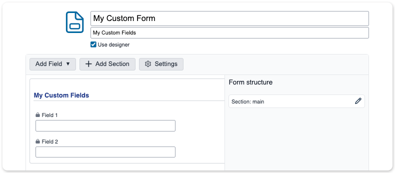
A brand new tool for creating UI extensions is now available for account designers and administrators in Xurrent. It is a visual ‘what you see is what you get (wysiwyg)’ designer, in which fields and sections can be easily created, added, moved, or removed. This is now the default way to create new UI extensions. It is, however, still possible to use the classic UI extension builder, by unchecking the Use designer box. When editing a UI extension, this box is ticked if the UI extension was lastly edited (or created) using the Designer.
One change that immediately stands out, is that the field labels are now above the fields and no longer in front of them. This is not only a visual improvement, but it also enables the use of a two column design for UI extensions. Eventually, this will become the standard in all Xurrent user interfaces. Another important difference is that JavaScript and CSS are not available in the Designer. However, conditions, validations, and other options can be assigned to the fields and sections. Calculations will also be made possible at a later stage.
UI Extension Fields
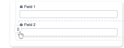
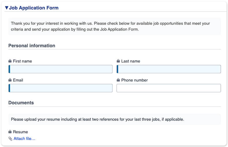
When creating a new UI extension, the UI Extension Designer already adds two basic text fields in a section called ‘main’. By pressing The Add field button, a new field of almost any type you could need is added. It is placed under the field that is currently selected. The order of the fields can easily be altered by dragging and dropping them into the right positions. By selecting any of the fields, the properties of that field can be changed. These depend on the type of the field that was previously selected. New field types are the Email field, which already contains email format validation, and the Static text field. The latter is not a field that can be populated, but allows the designer to add some explanatory text in the form.
New field properties have also been added, compared to the classic UI extension builder. In some cases, they were already available, but conditions can now be configured, instead of using JavaScript for defining them.
Conditional Logic
Some of the properties can have conditional logic. With this, a field can be made required, hidden, readonly, or validated. These conditions can be simple, such as ‘Field 2 is required when Field 1 is equal to yes’, or have multiple conditions. It is even possible to create nested conditions, as in the following example.
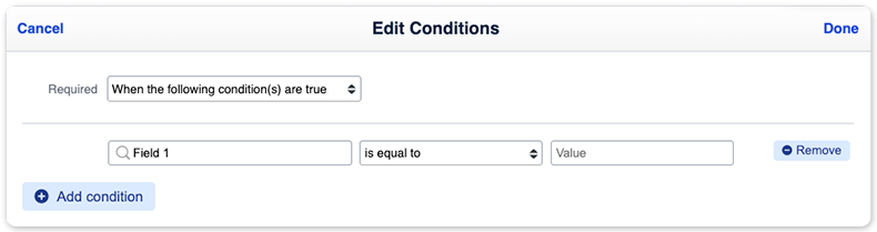
The example above shows a nested condition where Field 1 is required when:
(Field 1 = 1) AND (Field 2 = 2 OR Field 3 = 3)
Public
This property already existed, but was called ‘Visible only to specialists, auditors, and account administrators of this account’.
Readonly
Creating readonly fields in the Classic Builder was only possible in JavaScript. Fields can now easily be set to readonly based on the value of another field, or always. This can be useful when a field is populated by an external application using an API, for example.
Validated
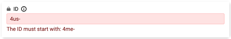
Enabling this property allows one or more conditions and a customizable validation message to be specified on a field. These validations are available on text, date (and time), number, email, textarea, and selectbox fields. If the field value is not valid, the form cannot be saved.
Full width
The input field is displayed over the full width that is available in the form. In two-column layouts, the input field will have the standard size.
Placeholder
Text entered in the Placeholder property is added inside the input field, as a hint to the correct format of the value.

Tooltip
Add a ⓘ to the field with an explanation of what this field will be user for, or suggestions about the contents.

Other properties
Depending on the field type, several other properties or conditions can be added to a field, such as the maximum number of characters, text case (transform to all caps or all lowercase), an initial value, minimum or maximum value, etc. These should be self-explanatory.
The Copy Field button duplicates a field, including its properties and conditions.
UI Extension Sections
Just as with the Classic Builder, it is possible to divide custom forms into sections. This is now even easier, by using the dedicated button at the top of the Designer. Another big improvement, and not available in the Classic Builder without using CSS, is the possibility to set the layout to two columns.

A section can have multiple layouts. Visibility conditions can also be set on sections, to make a section only visible depending on the value of a specific field (or several fields) in another section, or on the status of impact of a request, for example. The Section Settings become available when a section is selected.
Conversion From Classic Builder to Designer

Because the new UI Extension Designer does not have all the possibilities that the Classic Builder has when JavaScript and CSS are added, and, on the other hand, the Classic Builder does not have all the options that are available in the Designer, it is not possible to completely convert one into the other. It is, however, possible to convert UI extensions that were built with the Classic Builder to the new Designer. The contents of the JavaScript and CSS tabs are not included in such a conversion, so additional logic will still need to be added. To start the conversion, just select ‘Use designer’. A message is displayed to remind you of the conditional logic.
If it turns out that a conversion is not possible, even after adding conditional logic, it is still possible to revert to a previous version of the UI extension, using the version control feature that was introduced earlier this year.