


ITxM is here
Experience the future of IT
A Modern Platform for Every Operational Workflow
Modern organizations depend on both predictable service delivery and fast, coordinated incident response. Xurrent brings ITSM and IMR into one connected platform so every request, alert, incident, and update moves through a consistent workflow.
A Connected Flow from Request to Resolution
When IT and engineering operate in different systems, handoffs slow down, context gets lost, and teams react instead of anticipate. Xurrent unifies service, operational, and incident workflows so requests move cleanly across teams with shared visibility.
Operational Resilience
Give engineering teams clarity, alignment, and speed during every incident. Xurrent IMR combines AI-assisted detection, coordinated response workflows, and continuous learning to help teams deliver reliability at scale.
Ironclad Security
Xurrent protects your operational data across service, incident, and automation workflows. With enterprise-grade compliance, secure AI isolation, and reliable architecture, teams operate confidently at scale.
Limitless Performance
As organizations grow, so does operational load. Xurrent supports rapid service expansion, incident management, and cross-team workflows through a scalable cloud architecture built for both internal and production workflows.
Smart Incident Routing
Intelligent correlation reduces noise and ensures alerts reach the right people at the right time.
Faster Resolution Workflows
Guided actions, automated timelines, and ChatOps integration accelerate MTTR throughout the reliability lifecycle.
Continuous Service Learning
AI builds detailed postmortems automatically, helping teams learn from incidents without heavy manual work.
Proven Enterprise Compliance
ISO 27001/27018, SOC 2 Type II, C5, and BYOK support for complete control and global trust.
Secure, Private AI Built on AWS Bedrock
All AI interactions remain isolated and are never used to train models.
Built for Stability and Uptime
ITIL-aligned workflows and incident-ready systems ensure reliability across the organization.
Elastic Cloud Architecture
Cloud-native design ensures peak performance, automatic scaling, and high availability—no matter the demand.
Expand Services Across the Entire Business
HR, Finance, Facilities, Customer Ops, Engineering, and IT operate on the same workflow foundation.
Reliability Built into Every Layer
From millisecond response times to 100% uptime, Xurrent is built for performance that never breaks stride.
AI In Every Workflow
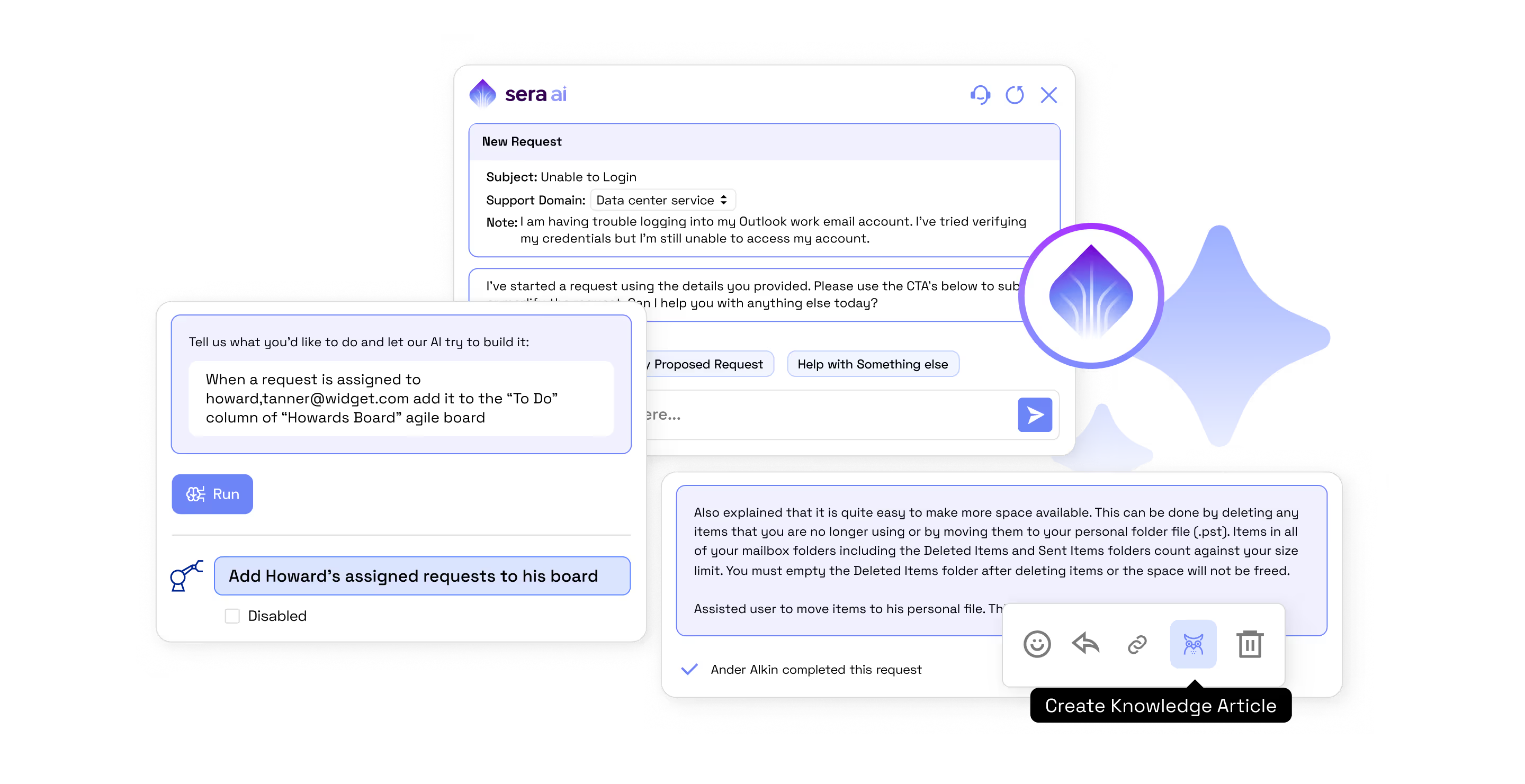
Legacy ITSM tools take six months to stand up and leave you buried in customization debt. Xurrent is different. Sera AI, the fabric of the Xurrent platform, powers automation, knowledge, and workflows.
Ironclad Security
Your data stays your data, protected by layers of stringent security at no extra cost. Xurrent is advanced where it counts: security, maturity, and trust.

Don’t just scale your tech, scale your entire organization. From
IT to HR, Finance, and beyond, Xurrent grows with you.
Give engineering teams clarity, alignment, and speed during
every incident. Xurrent IMR combines AI-assisted detection,
coordinated response workflows, and continuous learning to
help teams deliver reliability at scale.
Powering Modern IT and Business Operations
Today’s service management needs are light-years beyond traditional capabilities. Xurrent’s solutions address the core challenges your business, providing lightning-fast, AI-powered, intuitive service management.
The Definitive Guide to AI in Service & Operations

Trusted by Leaders, Built to Make Life Easier
Customers don’t just use Xurrent—they trust us to make their job easier. We eliminate friction, automate busywork, and give teams what they need to deliver exceptional services. No hidden fees. No clunky configs. Just a powerful platform built with you in mind.




Tools_HighPerformer_Enterprise_Europe_HighPerformer.avif)
Tools_UsersMostLikelyToRecommend_Mid-Market_Nps.avif)
Tools_EasiestToDoBusinessWith_Mid-Market_EaseOfDoingBusinessWith.avif)


.webp)